Orshot 2.0 is here. It's the biggest release we've shipped — not in new features, but in how the product feels end to end.
Over the last year we grew fast: Studio, embedded editors, signed URLs, social publishing, storage integrations, AI template generation. Every piece worked, but the surfaces around them drifted. 2.0 pulls everything back together around a single brand and a consistent experience.
A refreshed brand
A warmer, more confident visual identity. An editorial serif for display, a precise sans for interface, and a tight palette anchored on a deep ink neutral and a cobalt accent we call Tide. It's the same Orshot — just more recognizably itself.
One design system, everywhere
Every screen in Orshot — from the homepage to the Studio canvas to your billing page — now shares the same type scale, color palette, cards, buttons, and spacing. No more context-switching when you move between reading, building, and shipping.
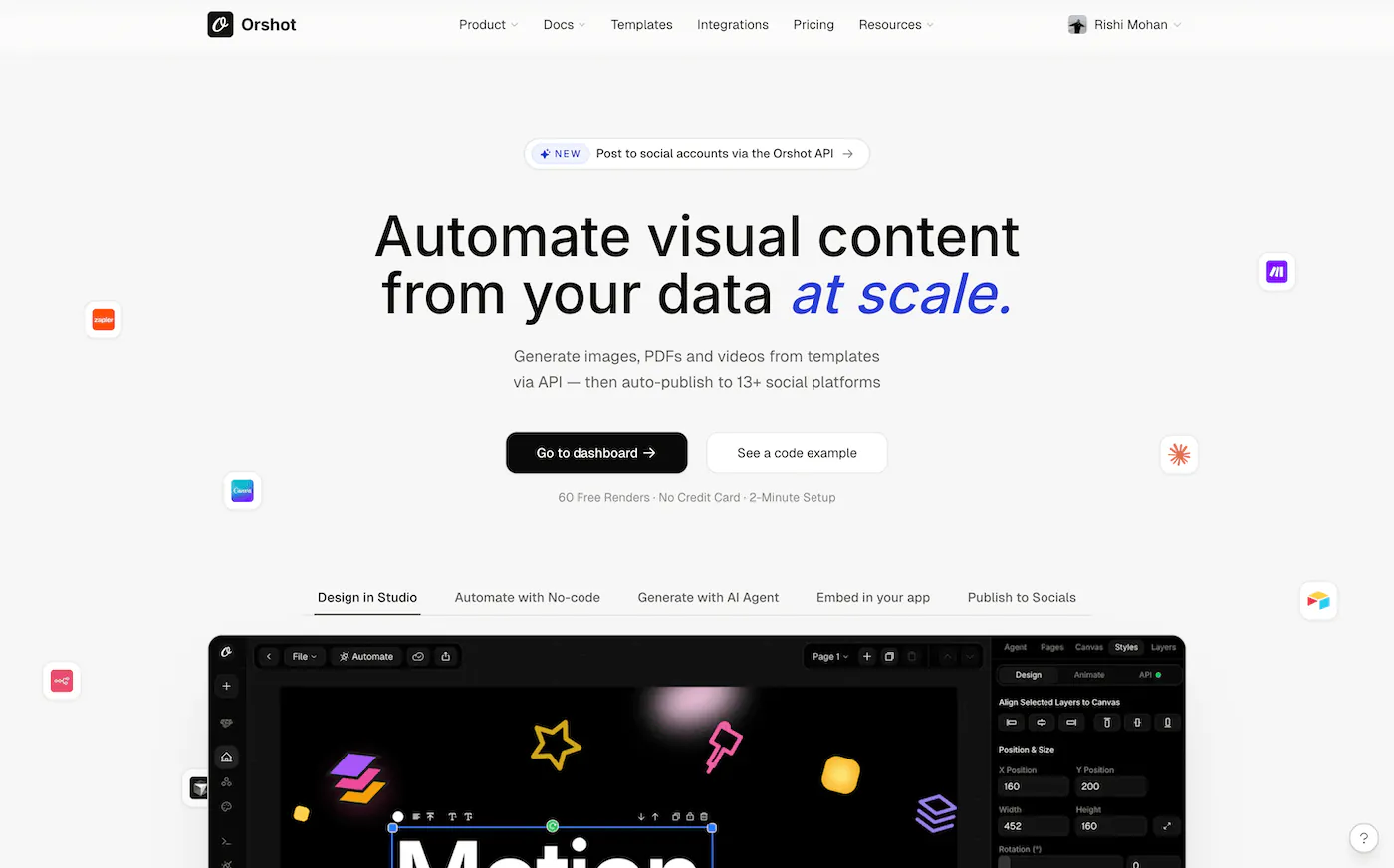
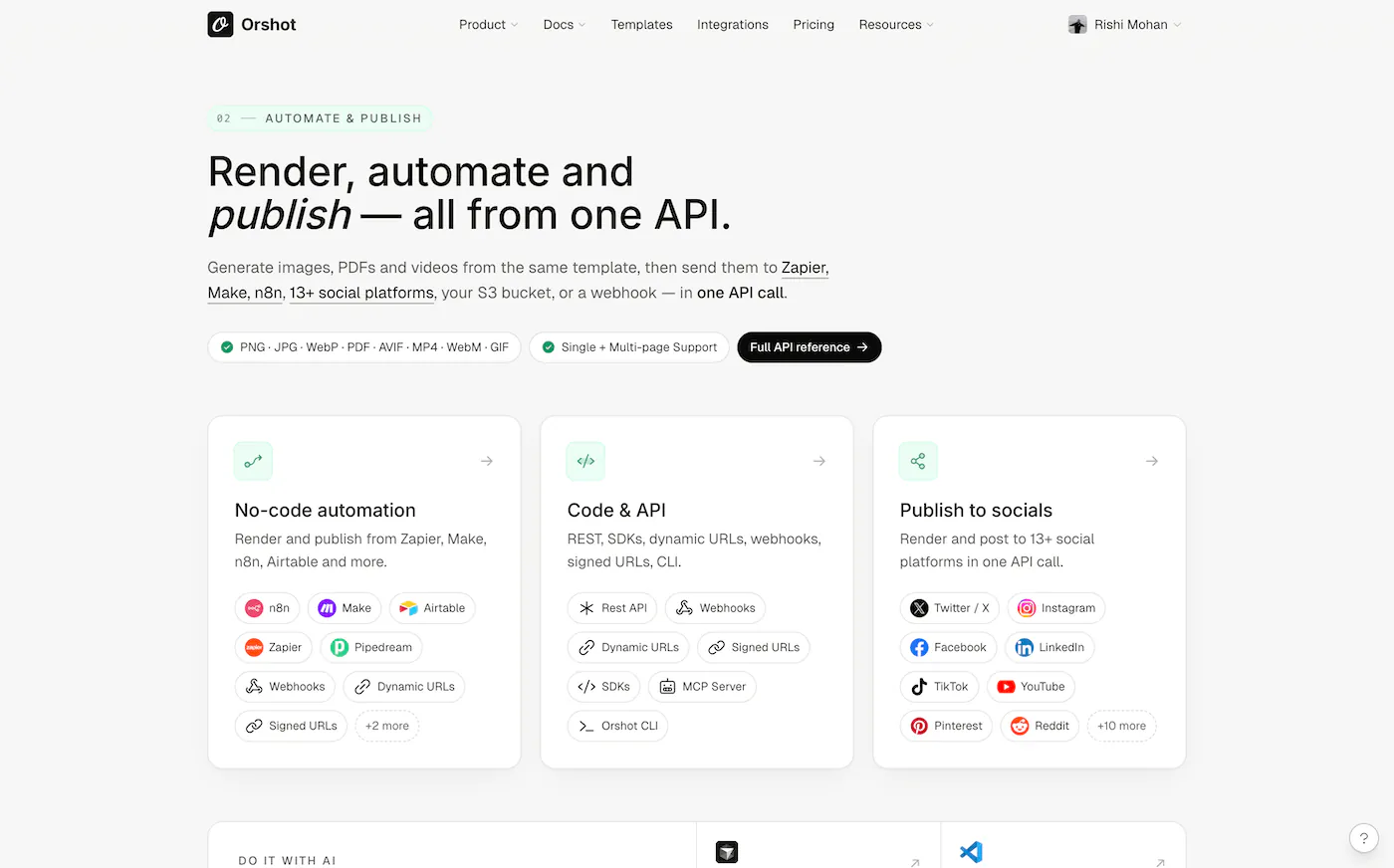
Marketing site, rebuilt
The homepage leads with what you actually get — design, automate, embed. Feature pages for Studio, Embed, Signed URLs, and Social Publishing each make a direct case. Customers, Agencies, Enterprise, and Pricing were rebuilt with the same discipline.
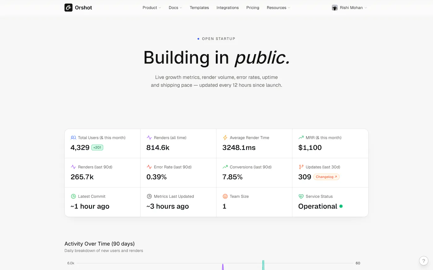
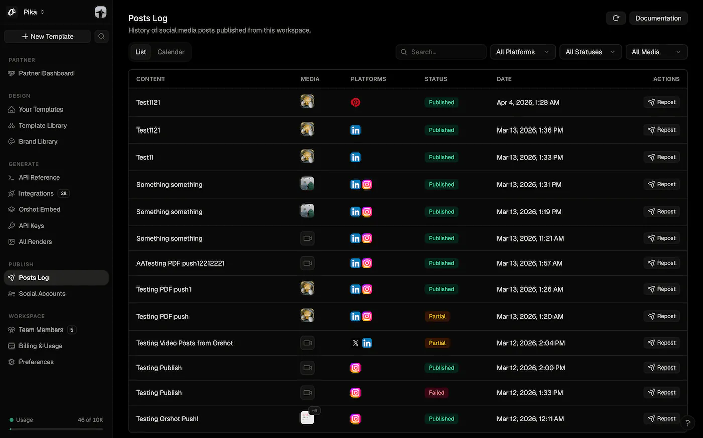
A calmer dashboard
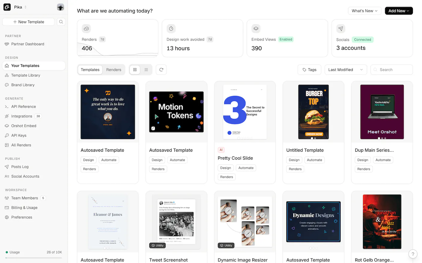
Billing and usage got a proper redesign — you can actually see what you're paying for and where your renders are going. Logs, integrations, team, settings, and socials were all tightened up. Same hierarchy everywhere means less to learn as you move around.
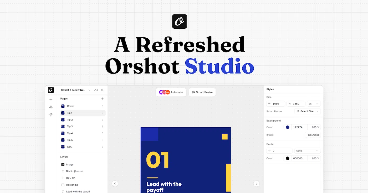
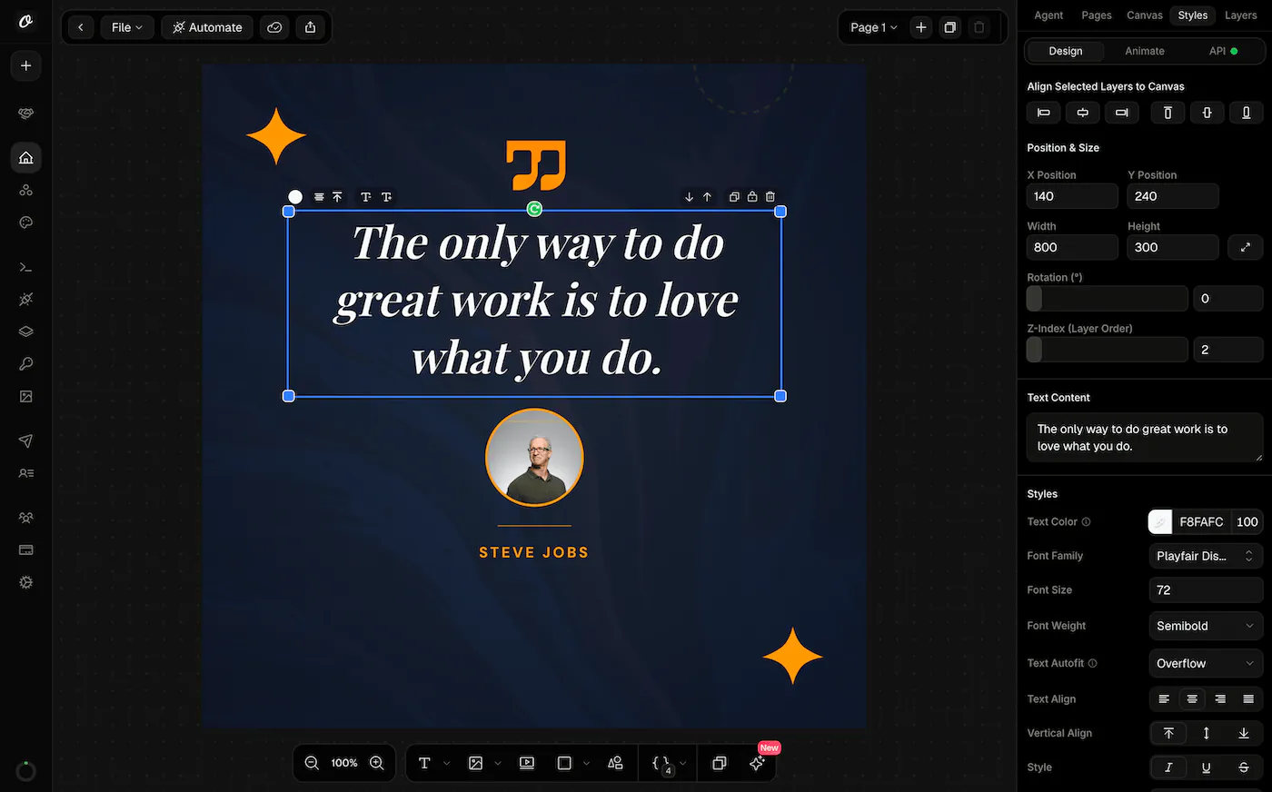
A more consistent Studio
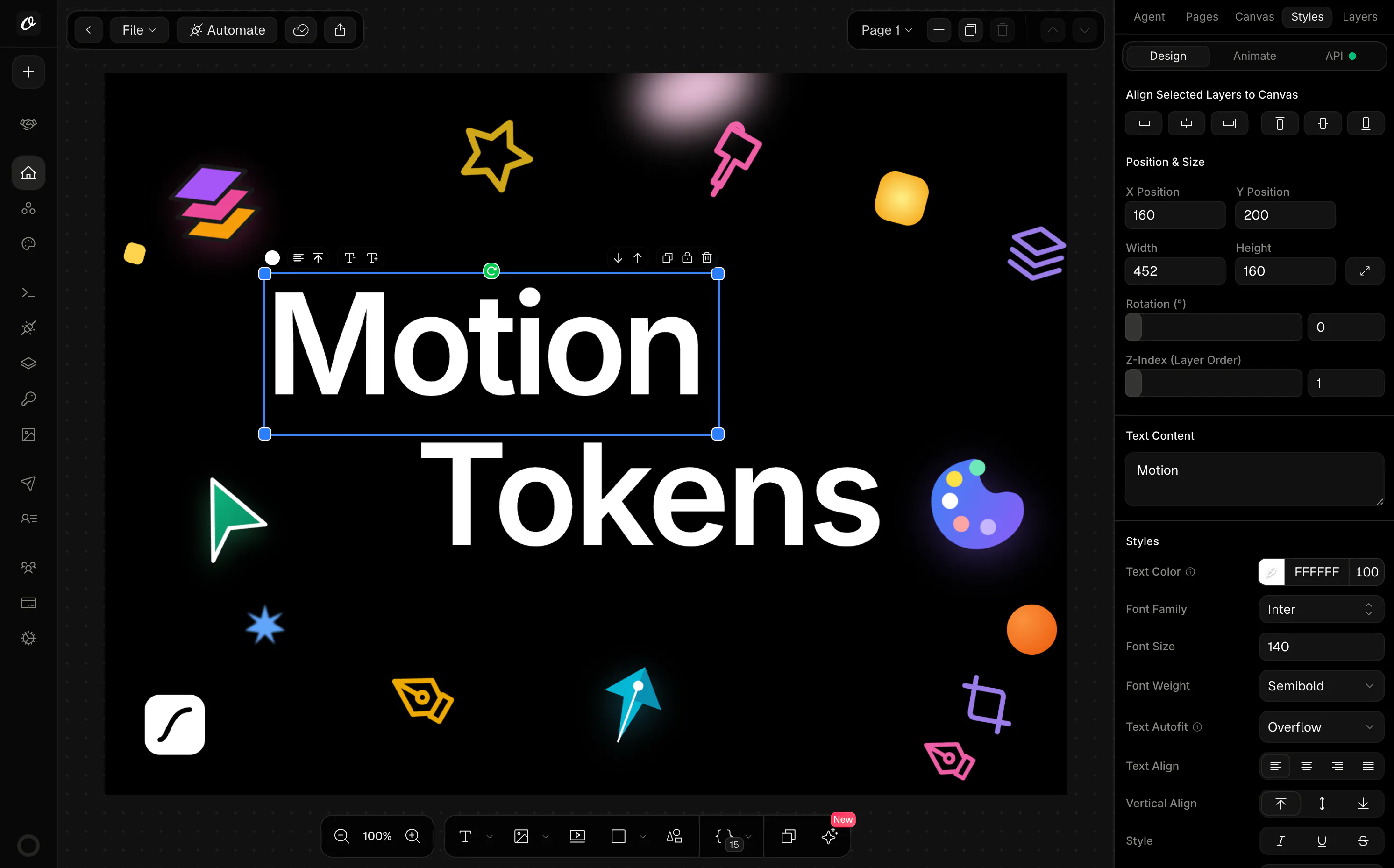
Panels, toolbars, dialogs, and controls now share their look with the rest of the product. The work surface is quieter so your template takes the focus.
Dark mode, properly
Every surface — marketing, Studio, dashboard, onboarding — works in dark mode. No seams, no washed-out chips, no accidental contrast.
What hasn't changed
Your API, your templates, your keys, your integrations, your workflows. Nothing you built on Orshot changes. 2.0 is a surface rewrite — render endpoints, modifications, and output formats are identical. Upgrade is a page refresh.
See it
The quickest way to feel the difference is to sign in and move around. If you're new, sign up — you'll be making real API calls before you finish reading this post.
As always, write back if anything feels off. A release this broad gets sharper with feedback.