
Every asset needs to exist in five sizes. You design a beautiful Instagram post, then rebuild it as a Story, a landscape ad, an OG image, a YouTube thumbnail — same content, same brand, redone by hand for every channel.
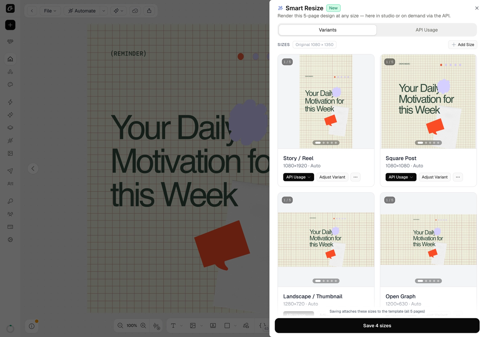
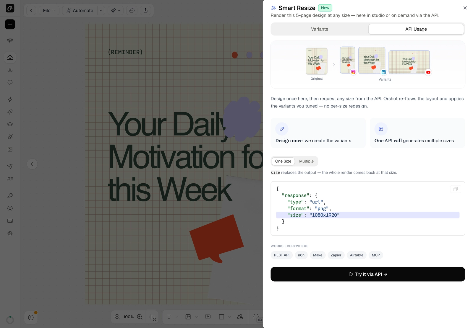
Smart Resize ends that. Design once in Orshot Studio and render the same template at any size — the layout re-flows to fit automatically. Use it right in the editor, or request any size on demand from the API.
What it does
Add the sizes you need and Orshot adapts the layout to each one — deterministically (the same design and size always look the same):
- Everything scales together, so proportions and spacing are preserved.
- Elements re-anchor to the edge they were designed against — a top-left logo stays top-left, a footer stays pinned to the bottom.
- Backgrounds and full-bleed images stretch to cover the new canvas.
- A safety guard keeps elements from overlapping.
Each size gets an instant, true-to-render preview with a status badge — Auto, AI (recomposed), or Edited.
How to use it in Studio
- Open your template and click Smart Resize in the top toolbar.
- + Add Size — pick a preset (Story, Square, OG image…) or enter a custom width × height.
- Reuse each size two ways: Add as new page / Replace current page, or fine-tune it with Adjust Variant.
- Save — a saved size renders exactly as you approved it.
Render any size from the API
Designed it once? Pull any size on demand. Add size to your render's response to replace the output size:
curl -X POST "https://api.orshot.com/v1/studio/render" \
  -H "Authorization: Bearer YOUR_API_KEY" \
  -H "Content-Type: application/json" \
  -d '{
    "templateId": "YOUR_TEMPLATE_ID",
    "response": { "type": "url", "format": "png", "size": "instagram-story" }
  }'
size takes a preset slug (instagram-story, og-image, youtube-thumbnail…) or a plain "WIDTHxHEIGHT" like "1080x1920".
Multiple sizes in one call
Need a whole set at once? extraSizes returns the same design at several sizes from a single request:
"response": {
  "type": "url", "format": "png",
  "extraSizes": ["1080x1920", "1080x1080", "1200x630"]
}
Each extra size comes back nested beside your render. Full API reference →
Where it shines
- Social campaigns — one design becomes a Story, a Feed post, and a landscape ad, all on brand.
- Programmatic OG images — render per-page OG and Twitter cards from a single template.
- Ad variants — generate every ad size from one source through the API.
- Embed customers — on Scale plans, your embedded-studio users can resize designs and add pages too (embed guide).
Start resizing
Smart Resize is live in Orshot Studio. Open any template, hit Smart Resize, and ship every size from one design.